


"Is it time for a rebrand?"
Every few years, when organizations begin asking this question, the discussion almost always starts with the visible pieces. The logo. The colors. The website. Maybe even a new tagline.
But those conversations often skip over a more important question.
"How much change do we actually need?"
Many organizations assume rebranding is an all-or-nothing decision—that you either keep everything or start over. In reality, successful brands evolve across a spectrum. Some simply refresh their appearance. Others modernize for new technologies. A few expand into entirely new markets. Only the rarest organizations truly reinvent themselves.
Understanding the difference can save years of work, protect valuable brand equity, and prevent organizations from fixing problems they don’t actually have.
Recognition Is One of Your Greatest Assets
Every interaction someone has with your organization creates a small deposit in what marketers call brand equity. Over time, those deposits become recognition, familiarity, and ultimately trust.
That recognition is surprisingly fragile.
When organizations change too much, too quickly, they risk asking their audiences to relearn what they’ve already spent years understanding. The strongest brands recognize that familiarity isn’t something to overcome. It’s something to protect.
That’s why we created the Brand Evolution Tower.
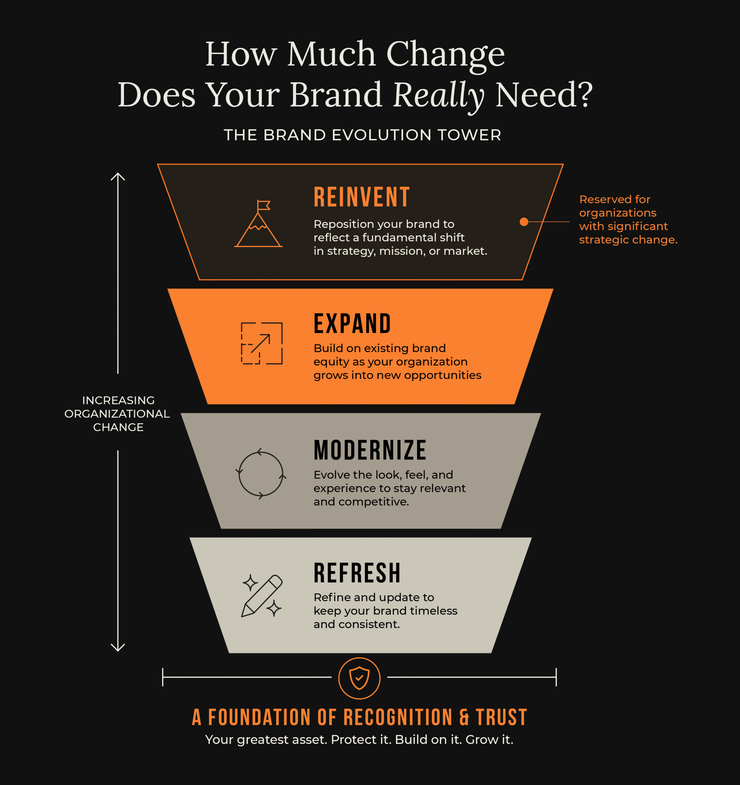
Rather than treating every rebrand as a complete transformation, it illustrates four distinct levels of change. Most organizations belong near the bottom. Very few belong at the top.
Refresh
A refresh improves how a brand looks without changing how people perceive it. Think of it as polishing the front door rather than rebuilding the house.
Typography becomes cleaner. Colors become more consistent. Logos are simplified for digital applications. The overall impression is fresher, but the organization remains immediately recognizable.
When Google introduced its current logo in 2015, many people barely noticed the change. That was intentional.
The company replaced its serif wordmark with a clean geometric sans-serif typeface designed to perform better across everything from desktop monitors to smartwatch screens. The familiar red, blue, yellow, and green color palette remained untouched, preserving decades of recognition while improving legibility in a digital-first world.
Google didn’t change who it was. It simply updated how it appeared. That’s the essence of a successful refresh.
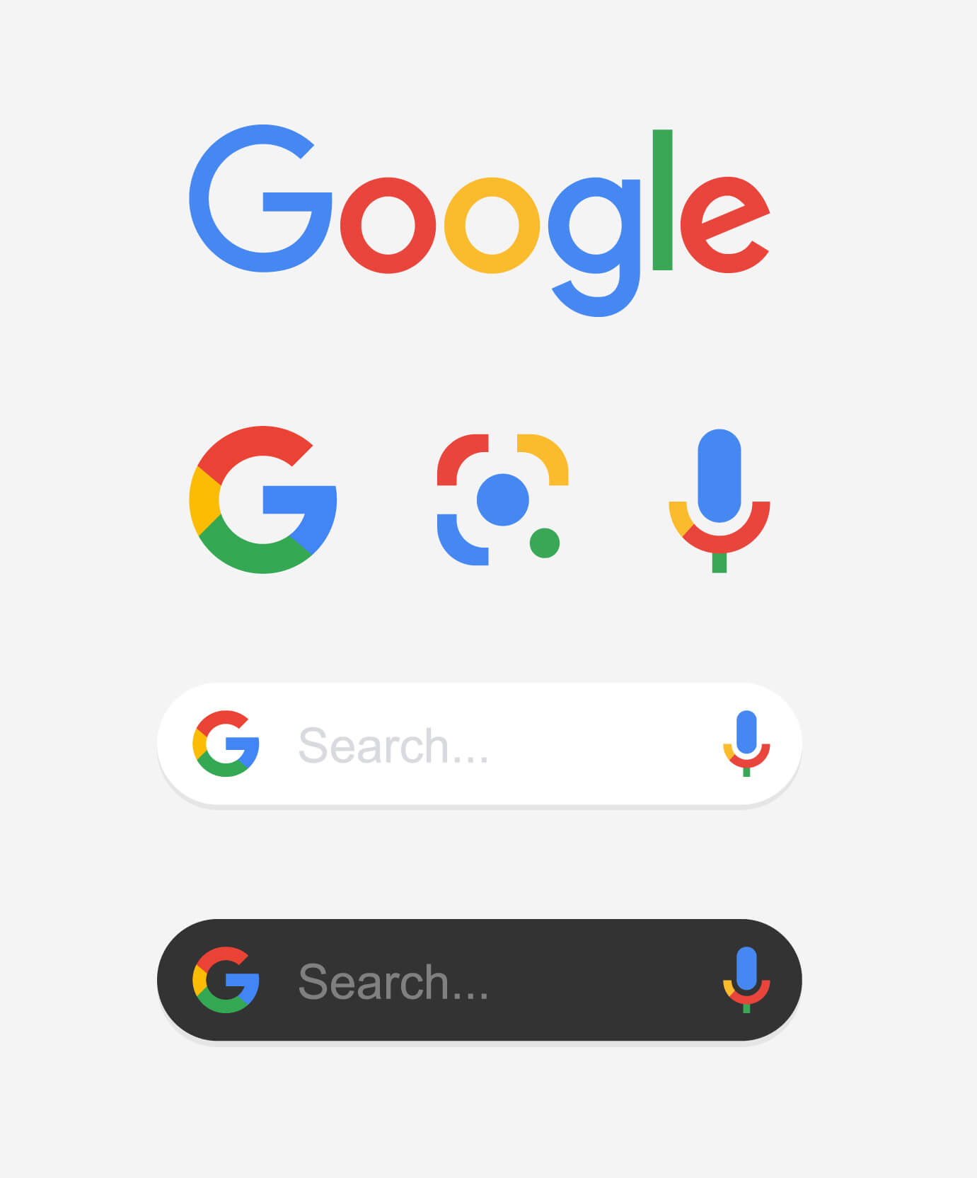
Image credit: blessed – stock.adobe.com
Modernize
Modernization goes beyond appearance. It prepares a brand for new channels, technologies, and audience expectations while preserving the identity people already trust.
Often, the logo changes very little. The surrounding brand system changes dramatically.

Image credit: desdemona72 – stock.adobe.com
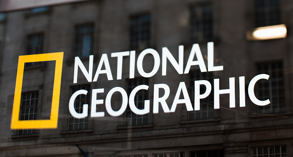
Image credit: MoreISO – iStockphoto.com
National Geographic
Most people immediately recognize National Geographic by its distinctive yellow rectangle.
Originally, that yellow border wasn’t designed as a logo at all. It simply framed the magazine’s cover, giving photographers a clean window for their images while creating a consistent visual presence on newsstands.
Over more than a century, that practical design decision became one of publishing’s most recognizable brand assets.
Today, National Geographic has expanded into television, streaming, digital publishing, social media, travel experiences, and education. Typography, photography, motion graphics, and digital interfaces have all evolved to meet modern audiences. The yellow frame never left.
National Geographic understood that one familiar element could anchor an entire system of change.
Expand
Sometimes organizations grow far beyond what they originally offered. The challenge isn’t changing the brand. It’s stretching it.
Successful expansion allows people to recognize the organization even as it enters entirely new markets.
LEGO
LEGO began in Denmark in 1932 as a manufacturer of wooden toys. The name comes from the Danish phrase leg godt, meaning “play well.”
Today, LEGO is much more than a toy company. It produces blockbuster films, robotics kits, educational curricula, video games, theme parks, retail stores, and digital experiences. Yet none of those expansions required abandoning what made LEGO recognizable.
The familiar red logo remains. The spirit of creativity remains. The experience of building remains.
LEGO expanded the brand rather than replacing it. That’s why every new product still feels unmistakably LEGO.
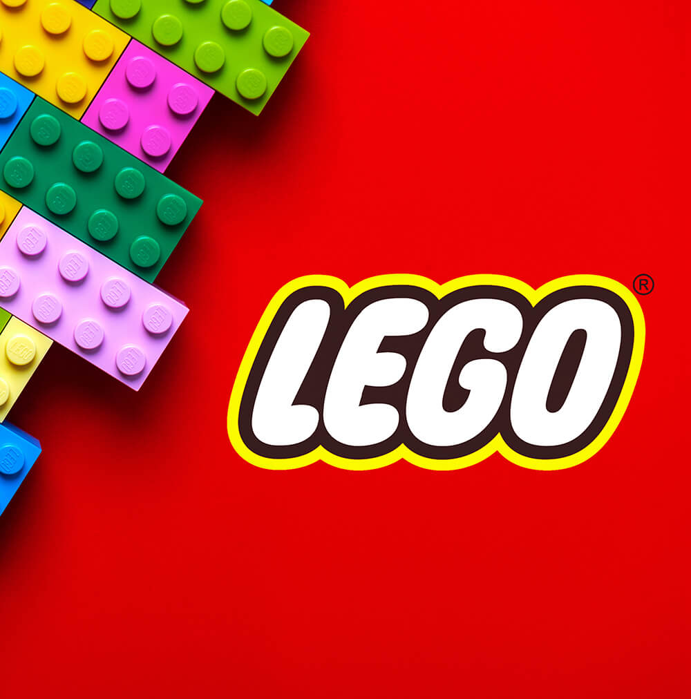
Image credit: esthermm – stock.adobe.com
Reinvent
Reinvention should be reserved for organizations whose strategy, audience, or mission has fundamentally changed. It’s the rarest form of brand evolution—and often the riskiest.
Done well, it signals a new direction. Done poorly, it sacrifices years of accumulated recognition.
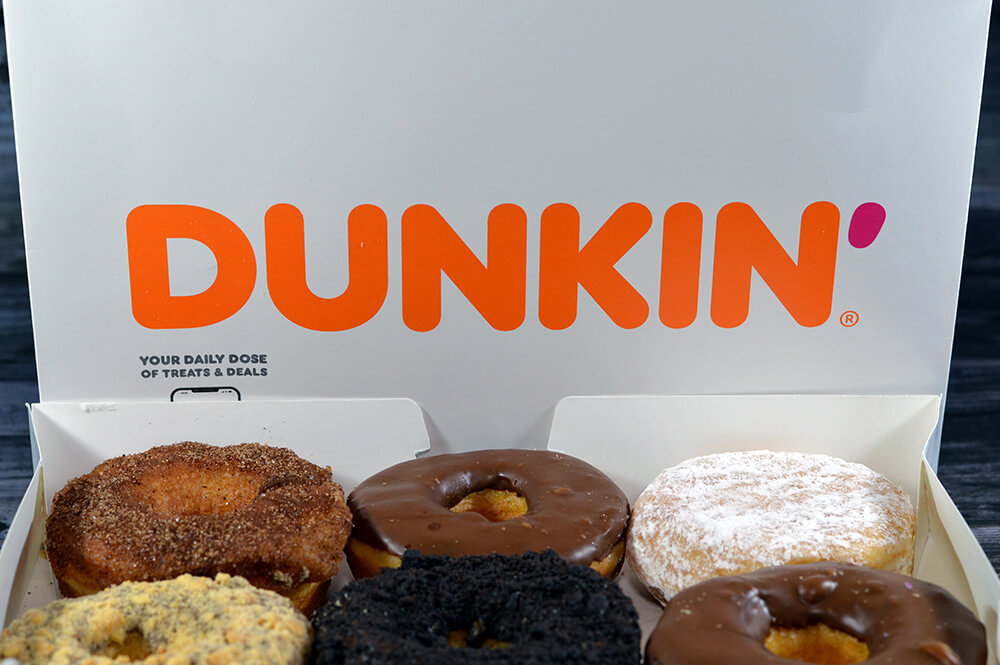
Image credit: Tamer – stock.adobe.com
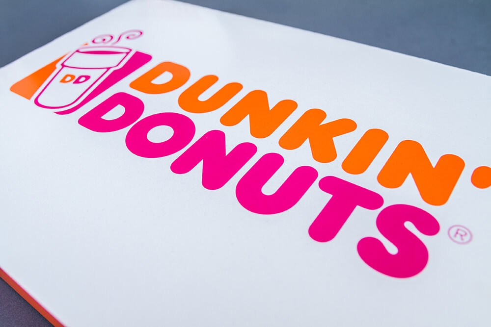
Image credit: Longfin Media – stock.adobe.com
Dunkin'
For decades, Dunkin’ Donuts was known primarily for… donuts. But by 2018, beverages accounted for a growing share of its business, and the company wanted consumers to think of it as an all-day coffee destination rather than a morning donut shop.
The solution wasn’t simply a new logo. It was a strategic repositioning. The company shortened its name to Dunkin’, redesigned stores around beverage service, invested heavily in mobile ordering and loyalty programs, and expanded its coffee offerings.
Dropping the word Donuts wasn’t cosmetic. It reflected a fundamental shift in business strategy. That’s what reinvention looks like.
So... Which One Does Your Organization Need?
Here’s the surprising part. Most organizations don’t need to reinvent themselves. In fact, they probably shouldn’t.
More often than not, the challenges leaders attribute to branding are actually issues of execution. A dated website. Inconsistent messaging. Photography that no longer reflects today’s audience. A visual identity that hasn’t been optimized for digital platforms. Those problems don’t require abandoning decades of recognition. They require thoughtful evolution.
Before asking, “Should we rebrand?”, ask a more strategic question:
"What are people already recognizing—and trusting—about us?"
Protect those things. Everything else can evolve.
Build Higher Only When You Need To
The strongest brands aren’t built by constantly tearing down the tower and starting over. They’re built one thoughtful level at a time. Sometimes that means refreshing what people already recognize. Sometimes it means modernizing for new audiences or technologies. Occasionally, it means expanding into entirely new markets. And only rarely does it require true reinvention.
The challenge isn’t deciding whether to change. It’s deciding how much change your organization actually needs. That’s the purpose of the Brand Evolution Tower—to remind us that every successful brand stands on a foundation of recognition and trust, and that the strongest brands don’t abandon that foundation. They build on it.